Cheryl Kwan
Bachelor of Design / Bachelor of Art Education
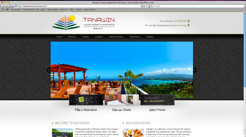
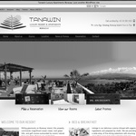
Tanawin Hotel Branding
The brand identity is currently used by the Tanawin luxury resort hotel in Philippines. The logo is of a palm tree (holiday destination symbol). The colour green represents the rich vegetation, the blue represents the clear water and the orange reveals the resort as a welcoming and relaxing place.
Contact & More Info
- Personal website
- kwan.cheryl@hotmail.com
- +61 425 950 001